Contemporary Editorial Áp phích nghệ thuật Design System - Prompt AI Chọn Lọc
Câu Lệnh Prompt Gốc (100% Nguyên Bản)
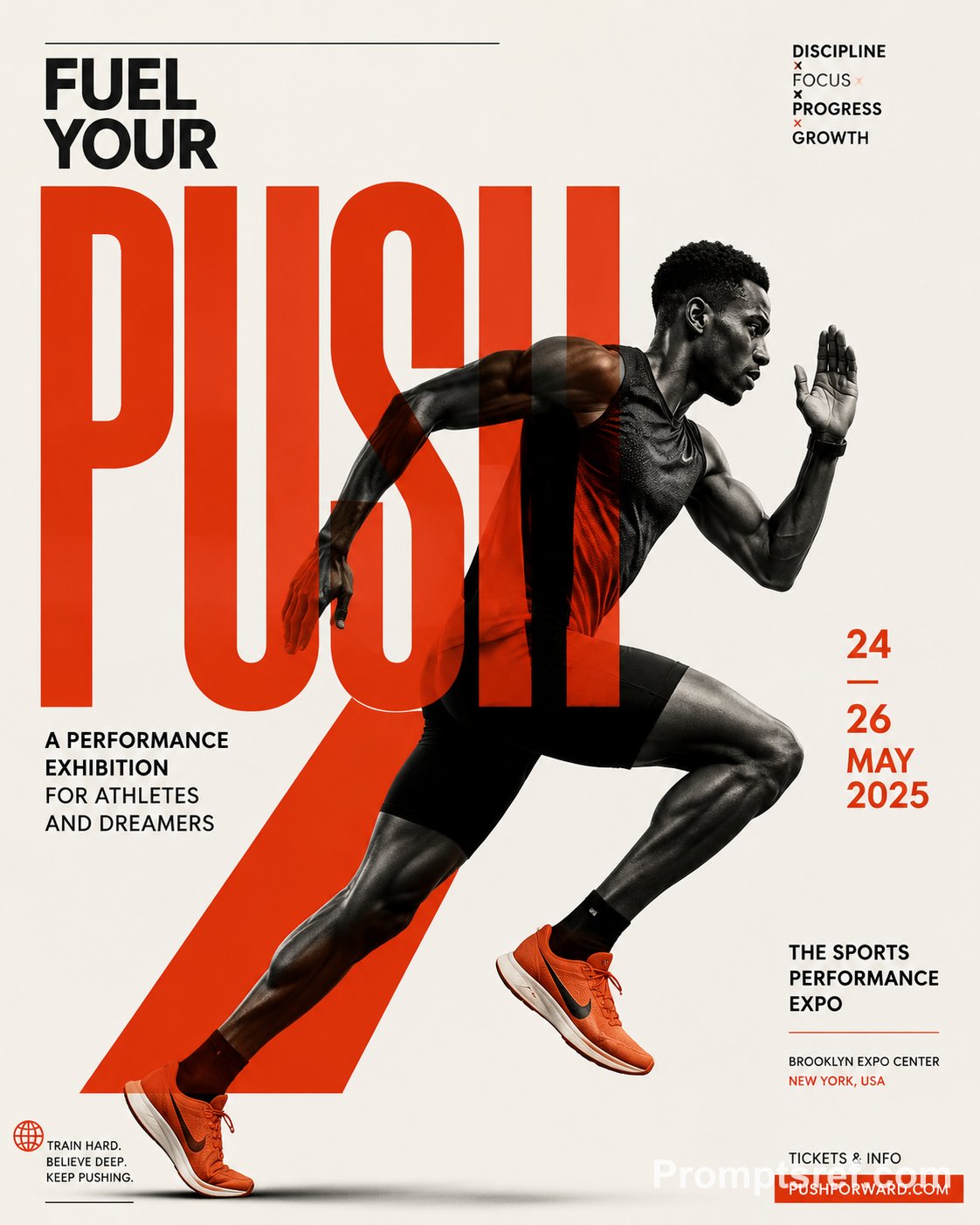
Create a premium, highly engaging editorial poster for [SUBJECT / BRAND / EVENT / PRODUCT], designed around strong visual hierarchy, intentional composition, and immediate 2–3 second readability.


**ART DIRECTION**


Style: [Swiss / Brutalist / Bauhaus / Minimal / Editorial / Futuristic / Architectural / Luxury]


Create a sophisticated contemporary graphic-design aesthetic rather than a generic advertising layout. Every element must have a clear compositional purpose.


**01 — VISUAL HIERARCHY**


Establish a clear viewing sequence:


1. Primary: "[MAIN HEADLINE]"

2. Secondary: "[HERO SUBJECT / IMAGE / OBJECT]"

3. Tertiary: "[SUBHEAD / DATE / DETAILS / CTA]"


The main message must remain recognizable even when viewed as a small thumbnail.


**02 — TYPOGRAPHY**


Use typography as an active visual element rather than simple text placement.


Use:


- Oversized display typography

- Strong differences in scale

- Tight, intentional kerning

- Controlled line spacing

- Strategic cropping

- Stacking and vertical alignment

- Selective text/subject overlaps

- Typographic masking where appropriate


Use maximum 1–2 complementary typefaces.


Primary typography: [BOLD CONDENSED / GROTESK / SERIF / CUSTOM]

Secondary typography: clean neutral sans-serif.


Keep all important text accurately spelled, readable, and professionally typeset.


**03 — COMPOSITION**


Build the poster using a disciplined editorial grid.


Create:


- One dominant focal point

- Strong alignment

- Clear margins

- Asymmetrical balance where appropriate

- Controlled tension

- Intentional negative space

- One or two elements subtly breaking the grid


Avoid placing every element in the center. Balance visual weight across the entire canvas.


**04 — HERO VISUAL**


Feature [SUBJECT] as the primary visual.


Presentation: "[FULL-BLEED / CUTOUT / 3D / PHOTOGRAPHIC / ILLUSTRATED / PAPER-CUT / ABSTRACT]"


Integrate the subject with the typography using layering, masking, foreground/background relationships, or controlled overlap.


The subject and headline should feel like one unified composition, not an image with text placed on top.


**05 — SCALE**


Use dramatic scale contrast:


Huge: main headline or hero element

Medium: secondary information

Small: supporting copy

Micro: technical/editorial details


Avoid using similar sizes for every element.


**06 — COLOR**


Palette:


Background: "[COLOR]"

Primary: "[COLOR]"

Accent: "[COLOR]"


Use a restrained 2–4 color system with one dominant accent.


Prioritize strong tonal contrast and readability.


**07 — DEPTH & LAYERING**


Hierarchy > Typography > Subject > Contrast > Negative Space > Details


**AVOID**


Generic centered layouts, excessive text, random decorative shapes, weak hierarchy, equal-sized elements, excessive fonts, unnecessary gradients, clutter, illegible typography, arbitrary placement, excessive effects, oversaturation, cheap advertising aesthetics, fake logos, watermarks, duplicated objects, malformed typography, and meaningless micro-text.


**OUTPUT**


Aspect ratio: "[4:5 / 2:3 / 3:4 / 9:16 / 16:9]"

Quality: ultra-high-resolution, print-quality finish

Layout: balanced from all edges with deliberate margins and professional spacing.
[!TIP] Sao chép nguyên vẹn prompt trên và đưa vào mô hình AI tương ứng.
Nguồn: congcu.ai
Comments
Join the discussionNo comments yet. Be the first to comment.
Tutorial
Nơi đây chia sẻ các tutorial, mẹo hay và thủ thuật công nghệ, giúp bạn khám phá công cụ mới và làm việc hiệu quả hơn.