Univer Premium Technology Brand Mark - Prompt AI Chọn Lọc
Câu Lệnh Prompt Gốc (100% Nguyên Bản)
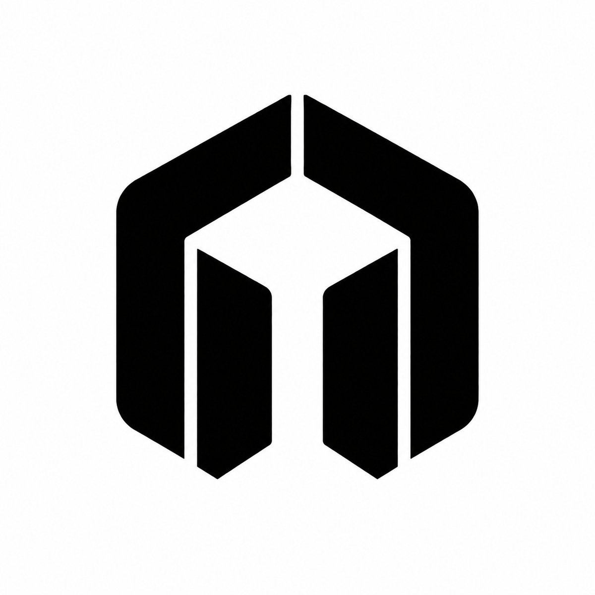
You are designing the master brand mark for a premium technology ecosystem named "Univer".


This is not a playful startup logo. This is a serious, long-term, world-class brand symbol meant to represent a platform for intelligence, context, memory, files, workflows, and trusted AI experiences.


Brand essence:

- universal

- intelligent

- structured

- calm

- powerful

- precise

- trustworthy

- modern

- enduring

- premium


The logo must feel like a symbol that could sit comfortably beside the branding of Apple, OpenAI, Stripe, Anthropic, Linear, Notion, or Arc, while remaining entirely original and unmistakably Univer.


Design objective:

Create a single iconic abstract mark with a subtle connection to the letter "U", but it must NOT be a literal U. The mark should feel like a gateway, aperture, frame, or portal into a larger intelligent system. It should imply entry, access, structure, and depth.


Core design principles:

- one unified symbol, not multiple shapes

- bold, stable silhouette

- strong negative space

- minimal geometry

- excellent optical balance

- architectural proportion

- premium restraint

- memorable from a distance

- clear and legible at tiny sizes

- capable of functioning as an app icon, favicon, embossed hardware mark, product badge, and brand stamp


Visual direction:

- geometric, not organic

- minimal, not decorative

- confident, not flashy

- timeless, not trendy

- futuristic, but not cliché futuristic

- elegant, but not luxurious in a fashion-brand way

- strong, but not aggressive

- simple, but not generic


The symbol should evoke:

- a doorway into knowledge

- a controlled opening

- a structured portal

- a contained universe

- a trusted environment

- a system that organizes complexity


Important constraints:

- do NOT create a literal uppercase U

- do NOT use obvious AI clichés: brain, circuit, neuron, atom, globe, star, sparkle, chatbot bubble, robot face, AI swirl, hexagon network, or generic tech mark

- do NOT make it look like a random abstract art piece

- do NOT make it too complex

- do NOT use thin lines or fragile details

- do NOT use gradients, shadows, bevels, 3D effects, or glossy rendering

- do NOT make it look like a temporary startup logo

- do NOT make it look like a gaming logo or a crypto logo

- do NOT use a lowercase or uppercase text logo as the main symbol


Form language:

- strong outer mass

- controlled inner cut or aperture

- high-quality negative space

- subtle internal symmetry

- possible hidden suggestion of U through shape or void, but only as a discovery, never as an obvious literal form


Brand behavior:

This symbol should look equally strong:

- in black on white

- in white on black

- as a standalone icon

- when embossed or engraved

- when reduced to 16x16 px

- when printed on product surfaces

- when used across the full family: Univer, Apex, Normal, Swift


Typography note:

The logo mark should be able to live independently. Wordmark is optional and secondary. The symbol must carry the identity on its own.


Design tone:

- premium enterprise

- calm authority

- deep intelligence

- highly refined simplicity

- emotionally restrained

- confident and enduring


Output expectations:

Provide a distinctive, polished, brand-ready master mark that feels inevitable, as if it has always belonged to Univer.
[!TIP] Sao chép nguyên vẹn prompt trên và đưa vào mô hình AI tương ứng.
Nguồn: congcu.ai
Comments
Join the discussionNo comments yet. Be the first to comment.
Tutorial
Nơi đây chia sẻ các tutorial, mẹo hay và thủ thuật công nghệ, giúp bạn khám phá công cụ mới và làm việc hiệu quả hơn.